


Nothing escapes colour. It captures us before being captured. Seeing it is something else. Because it belongs to the sensitive order of the world, artists of all types – designers, architects, sculptors, writers, film makers and musicians – are immediately concerned. They seize it as if it were a phenomenon, whose principles, nature and effects are to be explored, which enables them to broadcast its physical and symbolic substance. Telling the stories of a few subjectively chosen works is a way to dive into colour and the experiences of it that those who created the works relate. A white page to cover with colours.
They gave me colour
Jeanne Quéheillard,
design theoretician
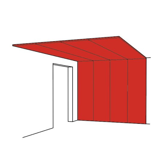
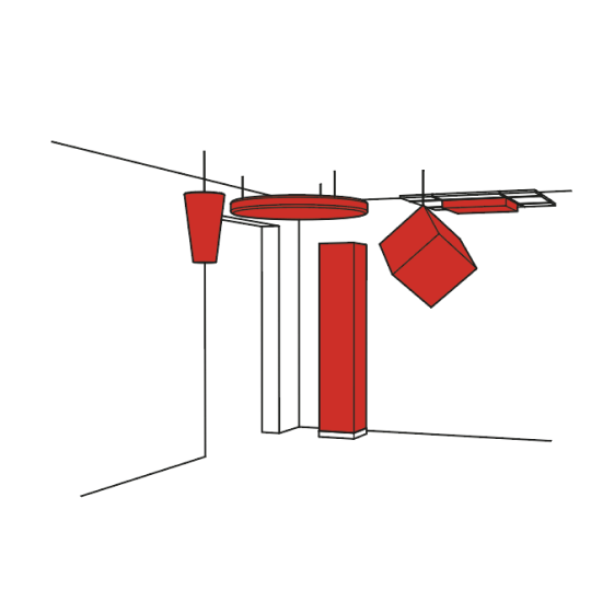
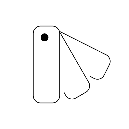
Cécile Bart
Suspens de Rennes, 2018, ensemble de 13 peintures/écrans
Peinture aux résines alkydes, Tergal « plein jour »,
cadre aluminium, câbles, fourrures aluminium
FRAC Bretagne, Rennes, 23 décembre 2018 - 10 mars 2019
Photographie Marielys Lorthios
©
Attaching colour
The Italian designer Ettore Sottsass’s houses, furniture, ceramics, glassware, ornaments and texts cannot go unnoticed. The stacks, imbalances of mass, liveliness of colour, reverberation of gold, absorption of black, and the poetry of his writings recount the world, its techniques, its cultures and primarily its occupants. These diverse, metaphorical and cosmic constructions display an underlying insatiable appetite and undying vitality.
For him, colour is a principle of existence. It is a language that precedes any word. In his article “Colors”1, written for Abet Laminati, a manufacturer of laminates, for which he invented a large number of patterns, he states his respect and love for colour. He describes “a powerful, magical, undefinable, flexible, permanent material” that he recommends should not be wasted. He holds on to a primitive relationship with colour, when as a child, “colors were the very things themselves. They were not “colors” as such, but simply wasps, raspberries, mushrooms, flowers, (etc.). Each thing was what it was with its color attached.” This “attached“ colour triggers feelings. Emblematic of diversity, it counteracts unambiguous shapes. Even if “the scientific aspect” of colour is useful, Ettore Sottsass will not accept colour being “separate“ and categorised by the prescriptive world of standards that exists in industry, where he had worked.
“Colors escape and never stop. It’s impossible to say color number 225, because you never know if number 225 is next to or far away from the window, or if the light that is filtered by the glass is that of a winter fog or the white light of summer, or if it’s the light of the trees in Cambodia or that of the Thar desert.” At the French National Porcelain Works in Sèvres, there is a Sottsass red.
Discussing colour
The artist Anri Sala’s camera takes the spectator to the town of Tirana. The very strongly coloured facades are bizarre in this run-down town. With its collapsed buildings, ploughed up streets, busy inhabitants and stripped trees, the town feels as deserted as it is agitated. “The town was dead. A place that swallowed everything without getting sick,” explains the new mayor and former artist Edi Rama, who accompanies Anri Sala on this visit. His story is about a mad social experiment through colour. In 1997, the Albanian revolt was followed by a period of anarchy and pillage, which left its capital Tirana in ruins. He decided to repaint the facades. The film Damni i colori2 displays this political and aesthetic act, where painting the facades is not just decorative. “It was about finding a way for this town to become liveable in, and how to transform a town, where you have been condemned to stay by destiny, into a place where you actually choose to be.” It is the mark of change, both symbolic and physical. Edi Rama himself devised a scheme to organise colours. He gave it an organic role, whereby buildings that have been suddenly and individually added can live together, despite the violation of space and neighbourhood. At first, the population was shocked and politicians were against this artistic initiative, considering it to be an inappropriate whim. However, 90% of the responses in a poll want it to continue. Everyone in Tirana, in the cafés, in the newspapers, on TV and radio and in the street started talking about the colours, discussing them with their neighbours, how suitable and contrasting they were. And thus colour has become the catalyst of a community and a democracy. Through this initiative, colour is now public business, providing a new take on the relationship between individuals and authority, and the conflict between individual and social life.
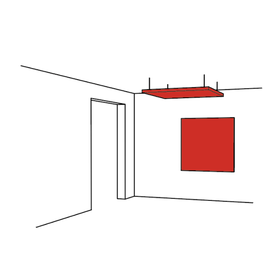
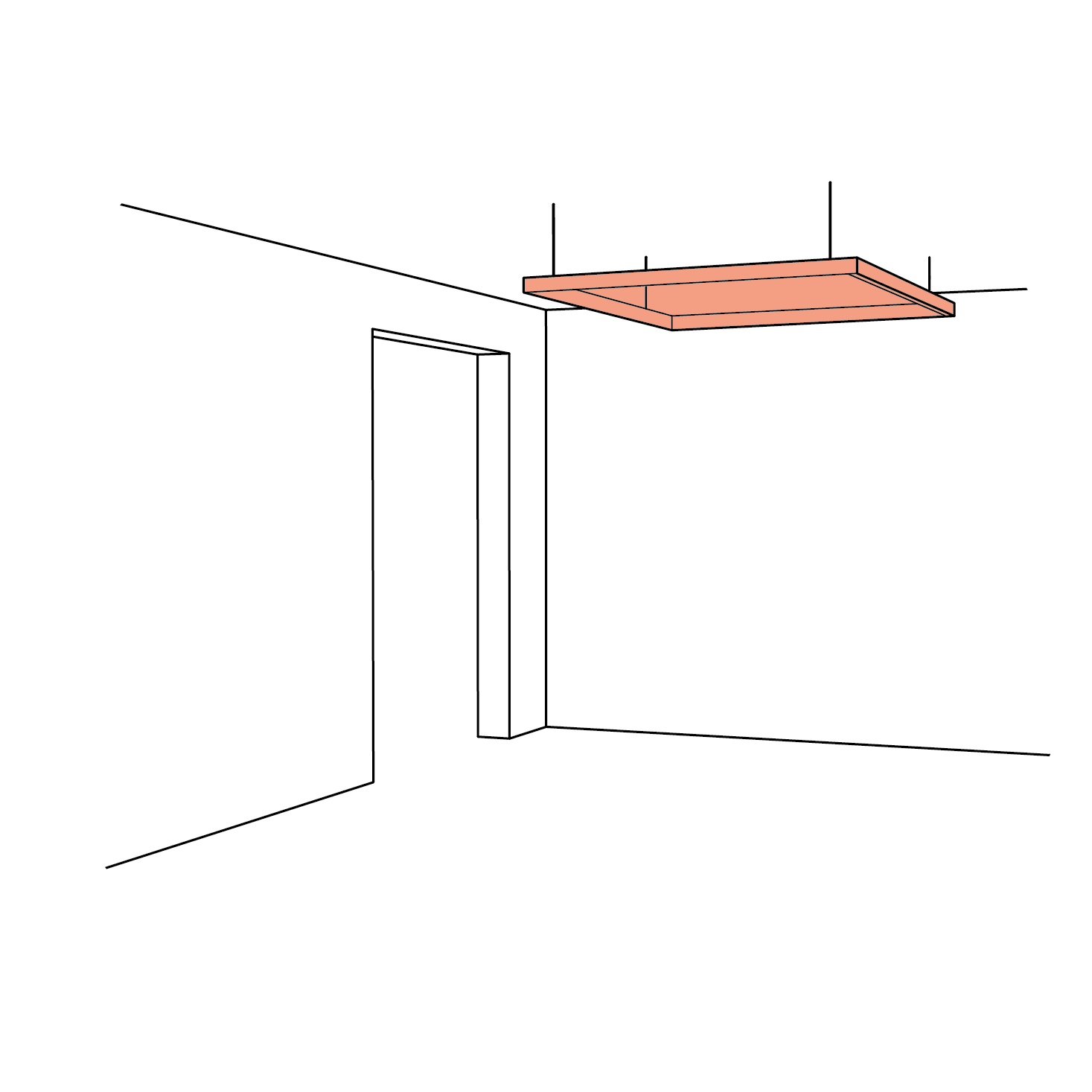
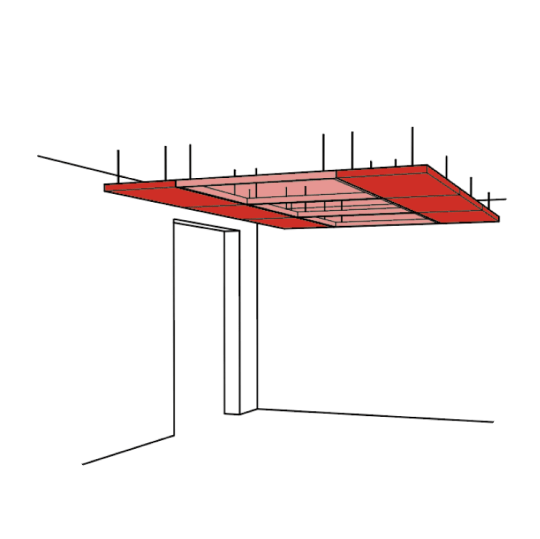
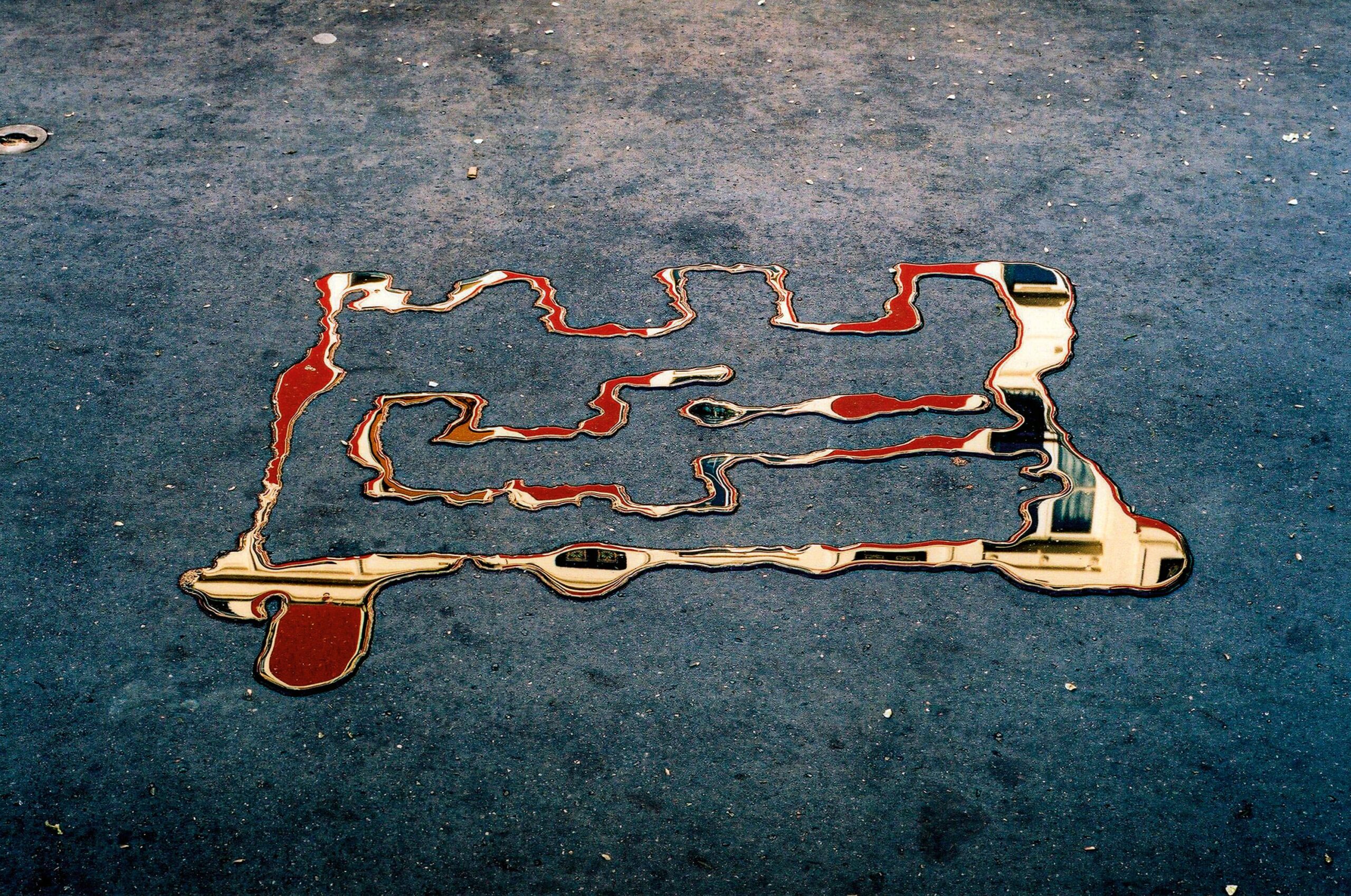
Simon Quéheillard
Asphalte, lumière, eau (photographie), 2007
©
Passing through colour
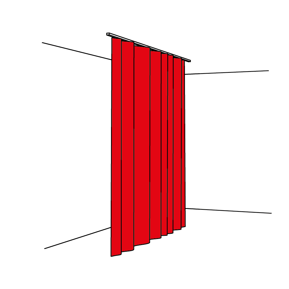
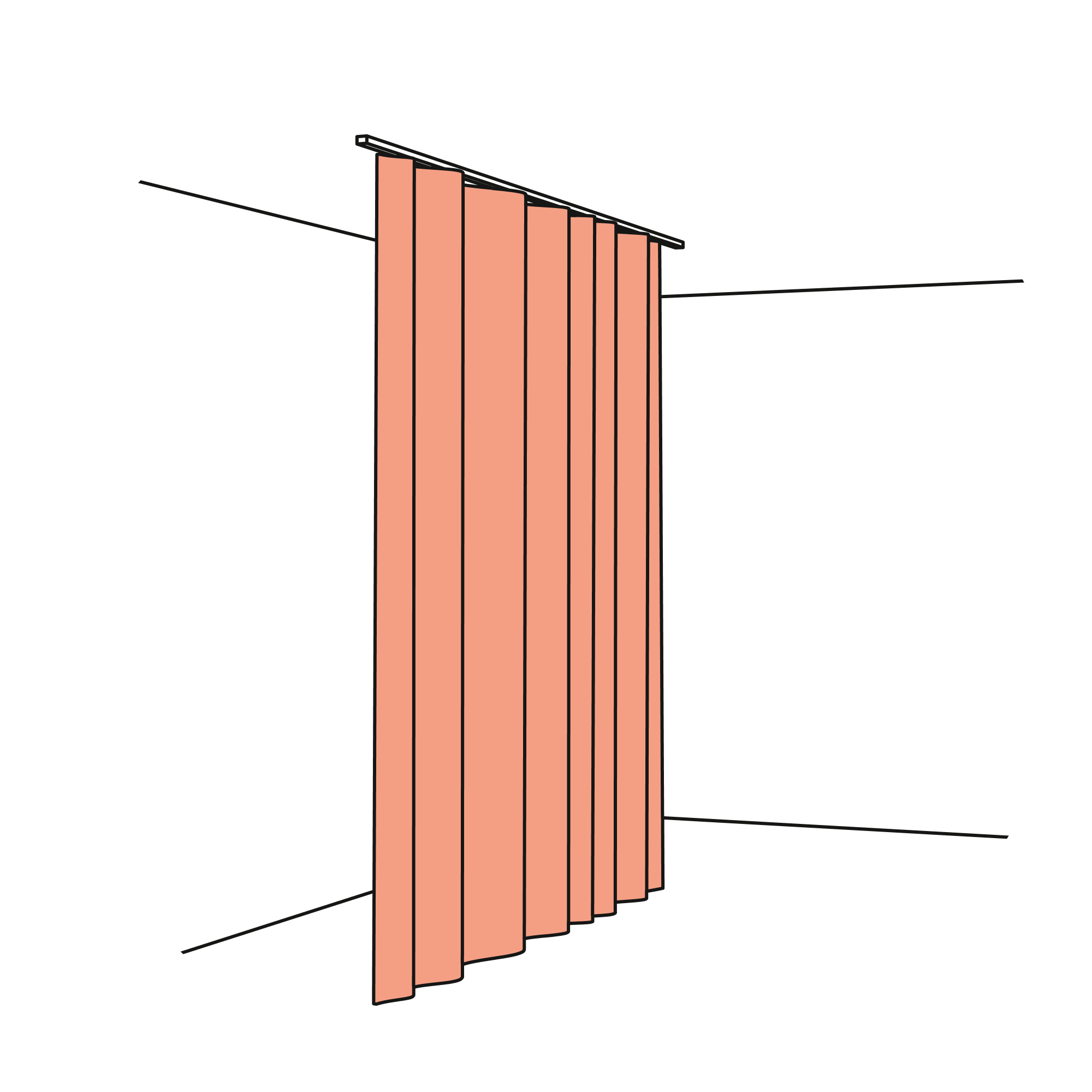
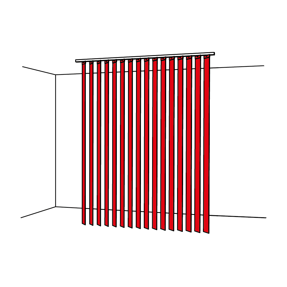
For just one evening, Cécile Bart exhibited “The painting of a day”3. As night fell, I watched “the gradual appearance of moving images”. Patterns of light and shade were projected onto and around a fabric screen made of “Full Daylight” Terylene. As the light slowly and progressively diminished, a vibrant image grew, while the audience turned into shadows. This simple, precise set-up let me experience something that is impossible to capture and keep. And as such, I remember it more as a disappearance rather than an appearance.
This false memory connected me to the “screen-paintings”, the distinctive “exploration tools” that Cécile Bart has been developing since 1986. A “Full Daylight” white Terylene curtain material is used as a transparent, non-reflecting screen. She uses a wide brush to apply a quite liquid paint to this fine veil, which impregnates the whole fabric, which she then wipes with a rag. The veil is then stretched on a frame to become a “screen-painting” through which light can pass. Cécile Bart installs her “screen-paintings” in places4,where she keeps the natural light. They are hung from the ceiling and walls, and positioned on the floor to form overlapping panels of colour. They project colour as much as they absorb the changes in light. “Colour is primarily a relational ingredient that lends structure and enables me to organise the whole group within the “painting-screen”, rather like the group of ballet dancers that provides a backdrop for the soloists”5, explains the artist. The spectators also contribute to the ballet. They take part in the colour experience by moving between, in front of, behind, below or above the “screen-paintings”. They create the transparent and opaque areas, the moiré effects and vibrations. Intrigued by the kinetic texture of colour, they understand the influence of its contiguity, the contrasts, the shading and the intensification.
Hearing colour
After a 4 minute 47 second introduction dominated by ten notes corresponding to the ten letters M-I-L-E-S-D-A-V-I-S, Aura6 plunges us into 6 minutes 5 seconds of White, 6 minutes 49 seconds of Yellow, 8 minutes 39 seconds of Orange, 6 minutes 6 seconds of Red, 8 minutes 12 seconds of Green, 6 minutes 36 seconds of Blue, 4 minutes 17 seconds of Electric Red, 6 minutes 5 seconds of Indigo, and 9 minutes 5 seconds of Violet. This orchestral arrangement by Danish trumpetist Palle Mikkelborg, attempts to relate visual and sound perceptions. What we are meant to hear is the colours that make up the visible aura of Miles Davis, his vital force. This mix of classical orchestra, electronic music and synthesizers is haunting. The “symphony” lures the listener into an imaginary visual world, where sounds have colour and colours have a sound. White is stellar and stellar is white. Red is intimate and intimate is red, orange is joyful and joyful is orange and so on. The use of terms, such as frequencies, rhythms, chromatic scales, tones and half-tones, and vibrations, already invite us to slide poetically between one sensorial world and the other.
With these correspondences, magically, Aura submerges the listener in colour, who swims in his or her private reality, made up of secret connotations that are taken for granted, yet difficult to explain, just as the poet Arthur Rimbaud introduced us to them. A black, E white, I red, U green, O blue; the vowels.
Emerging colour
Artist Simon Quéheillard chooses fine weather, when the ground is dry to make puddles on the pavements in Paris7. Parts of the surrounding environment are reflected in them: a facade, a flowerpot, a cloud, the sky, a tree, birds, stretches of colour, etc. With a technical device requiring water, weather conditions and a still or movie camera, the puddles become an instrument of perception. Some of them express the obvious: we see in colour. These colouristic smudges give colour its independence. Thanks to this ingenious device, colour is isolated and separated from the bodies to which it is attached. With a quick sweep of the arm, the water is poured on the ground using a bottle fitted with a nozzle. It is squirted to form ripples around the edges of the puddle, making it larger. The electrostatic properties of the water are thereby amplified, which changes the way in which the reflections come about. The ripples fracture the image of the object reflected, for example the facade of a building, and only fragments remain. When the water stops moving, the image freezes and colour appears as a single property. This results in “naturalist” photos, which document an effect of light, invisible to the naked eye. “What’s amazing, says Simon Quéheillard, isn’t the object, but the way the colour appears. It emerges, like form emerges in sculpture.” What is also amazing is the photographic process, the light, the electrostatic property of the water and the colour. By some mysterious alchemy, colour has been extracted, creating the illusion of its dissociation. Water appears to have been transformed into mercury, gold or lead.
Weaving colour
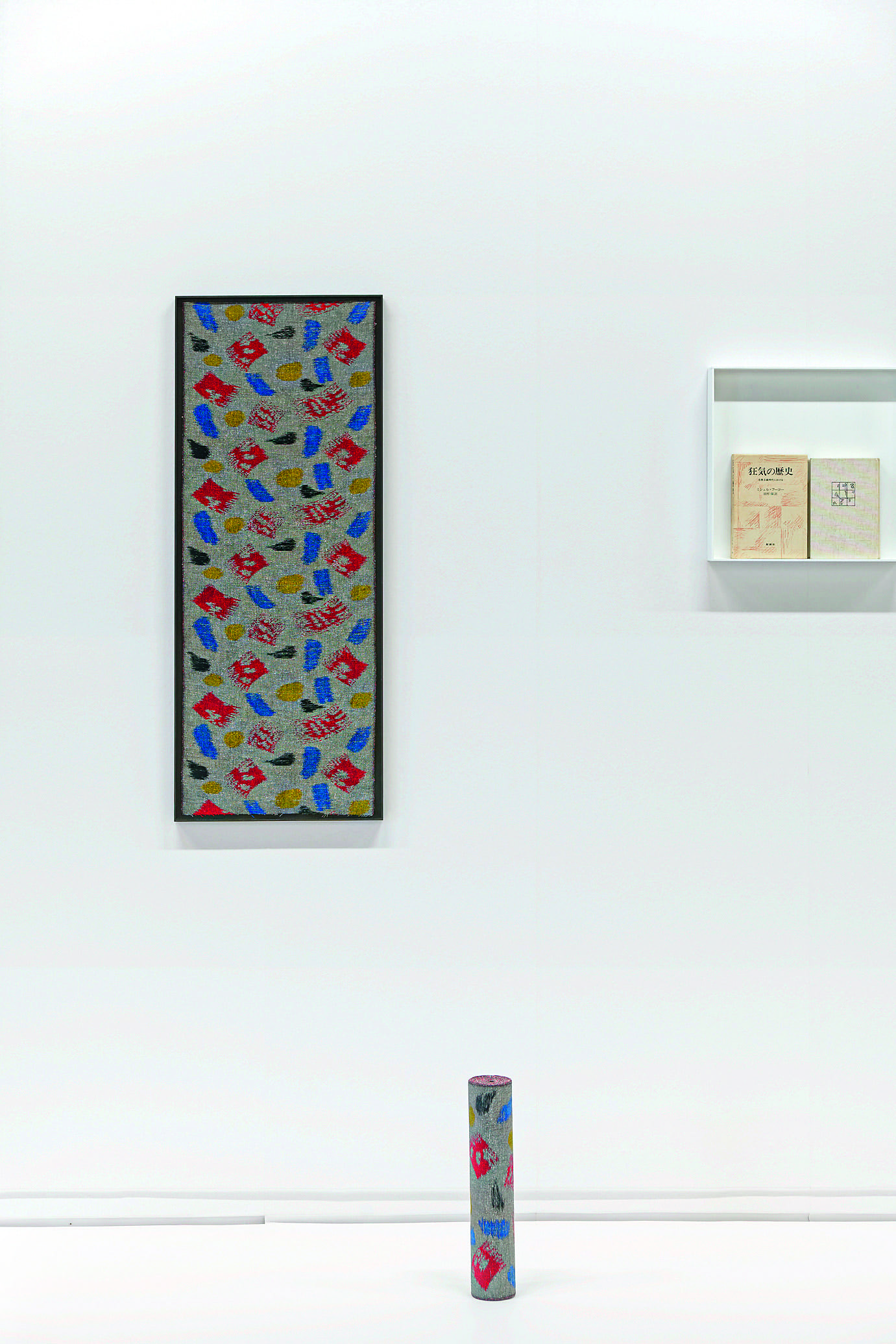
The artist Pierre Leguillon collects Japanese kasuri fabrics8. He uses them to devise a rambling series of works that he calls the Museum of Mistakes, in which he collects and pieces together reproducible images printed in a magazine or on a postcard, advertising objects, a fabric, record sleeve, and any other mass media. In this way he questions how art is admitted into our society. In his painting entitled Merida9, he paints by weaving. In 2017, when travelling to Mérida in Mexico, he noticed the amateur pictorial treatment of a wall in poor condition, in which wide brush strokes of red, blue, yellow and black had been used in an attempt to cover it up. When he travelled to Japan in 2018, in Yame on the island of Kyushu, he worked on this Mexican image with Kasuri master Kyozo Shimogawa to create Merida, a Kasuri fabric that he identifies as a painting. The abstract coloured patterns that came from the Mexican brush strokes were a real challenge for the Kasuri master craftsman. It took him three months to dye the weft thread with four colours and produce the effect of brush strokes. The master had to reverse his method. Starting from hanks of unfrayed nippu cotton, the threads were dyed red, then wrapped tight and bleached to enable the red patterns to emerge, while the black, yellow and blue patterns were created by hand. The black warp threads intensify the colour. The beauty of the Merida painting is in the “natural” imperfections characteristic of Kasuri. The colour saturation is irregular and the edges of the patterns are blurry. In these “mistakes”, the artist found how to create a painting with limitless variations. Produced in rolls 38 centimetres (15 inches) wide, the Merida painting is sold by the metre. Pierre Leguillon carries us to distant places. He entrusted colours born of impermanent daily life to a Japanese national heritage technique to mass-produce a work of art, working with artists10, who in art history have transcended the categories of original and multiple, of art, craft and industry. Woven colour is the result.
1. Les couleurs, in Notes sur la couleur, Ettore Sottsass et Barbara Radice, Abet Edizioni, 1993.
2. Damni i colori (Donne-moi les couleurs), Anri Sala, Voix Edi Rama. Vidéo 15’25“, 2003.
3. Invitée le 25 juin 2009 lors d’une séance de La Promesse de l’écran de Pierre Leguillon au CAPC à Bordeaux.
4. Parmi ses nombreuses installations : Habiter, 1994. Tanzen, 1998. Suspens de Rennes, 2018.
5. Cécile Bart, entretien avec Christian Besson, novembre 2011.
6. Aura a été enregistré en 1985 à Copenhague par Miles Davis et un big band. Publié par Columbia en 1989.
7. Ce que j’ai sous les yeux I et II, vidéos, 2004. Série de neuf photographies, dont Asphalte, lumière, eau, 2007.
8. Le kasuri japonais est un tissage fabriqué à partir de la technique de l’ikat. Les fils de trame et/ou de chaîne sont teintés avant tissage selon le principe de teinture à réserve par ligature. Les nouages se répartissent selon un plan de base qui anticipe les motifs. Cette technique a été très prisée au XVIIIe pour des soieries lyonnaises, sous le terme de « chinés à la branche ».
9. Pierre Leguillon, Mérida, 2018, 100 x 37,5 cm, pièce unique, partie d’une série. Produite en collaboration avec le maître de kasuri Kyösö Shimogawa à Yame, Japon.
10. Cette peinture se situe dans la filiation d’Anni Albers, Giuseppe Pinot-Gallizio ou encore Blinky Palermo.
How can we help?
F.A.Q.
Are our products fire-resistant?
Yes, our products are fire-resistant and comply with regulations governing public-access buildings.
Texaa solutions are tested for reaction to fire in accordance with international standards. Fire reaction test reports (fire certificates) are available upon request to support specification.
Please feel free to contact us by email at cf@texaa.co.uk or by phone at +44 (0) 20 7092 3435.
How can I get a quote?
By contacting the Texaa business representative of your region by telephone or e-mail and leaving your contact details and what you need. We will send you a quote promptly.
How can I order Texaa products?
Our products are manufactured in our workshop and made available to order. Just contact the Texaa business representative of your region. If you already have a quote, you can also contact the person handling your order: the name is at the top left of your quote.
How do I get my products installed?
Joiners and upholsterers are the best skilled to install our products easily. We work regularly with some professionals, who we can recommend. If you have a tradesperson, who you trust, we can support him/her. You can find our installation instructions and tips here.
Got a technical question?
All our technical data sheets are here. Your regional Texaa business representative can also help; please feel free to contact him/her.
Can I have an appointment?
Our business representatives travel every day to installation sites and to see our customers. Please feel free to contact them and suggest the best dates and times for you, preferably by e-mail.
Lead times
Our products are manufactured to order. Our standard manufacturing time is 3 weeks for most of our products. Non-standard products take from 5 weeks. We also perform miracles on a regular basis! Please feel free to contact us.
Who should I call?
To get a quote, a delivery time or technical information, we recommend you call your regional Texaa business representative, who you can find here.
Order tracking
If you need information about your order, please contact the person in charge of handling it: the name is at the top left of your quote.